NHL Uni Rankings (25-20)
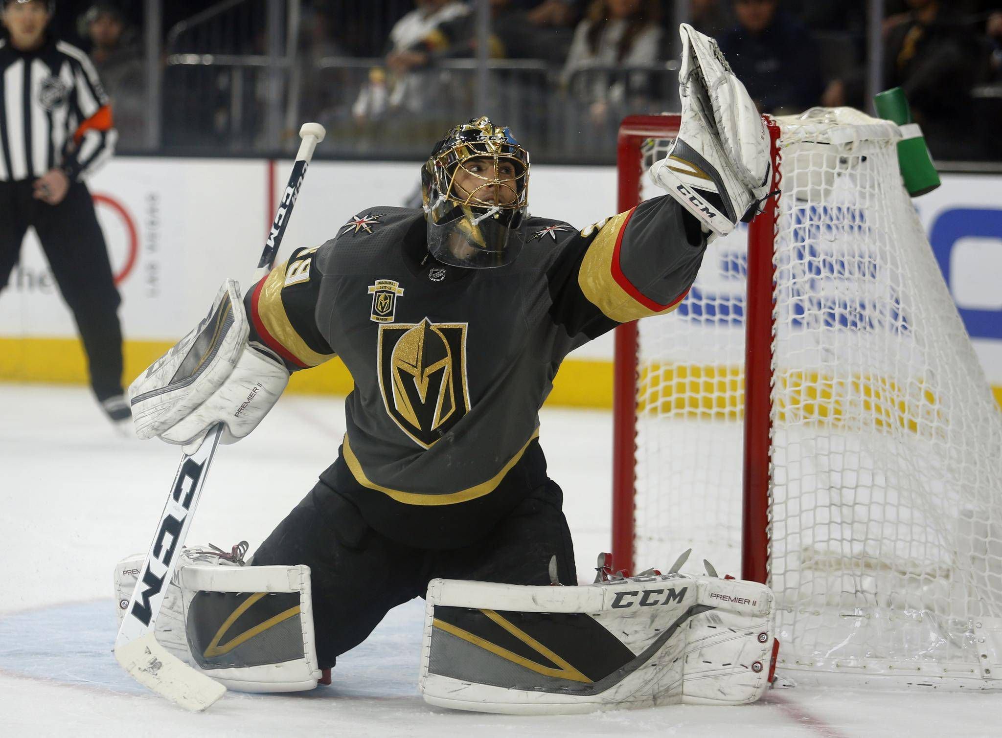

25. Vegas Golden Knights
As the latest addition to the NHL, the Golden Knights had a bit of a tough time selecting a color pallet that would be acceptable to use. The Ducks, Coyotes, Kings, and Avalanche are all their closest neighbors and they didn’t want to use anything too similar. This eliminated many color options for them to choose from. Granted they had a limited amount to work with, I still expected more from them. The grey primary color is a bit untraditional, but it looks nice. The red and gold trim is okay too, but my main issue with these is the logo. It feels boring and uninspired. The jerseys themselves pop more than the logo does and that’s not really saying too much. Also, white gloves are horrendous.

24. San Jose Sharks
The teal is probably the most unique color in the NHL. San Jose has that going for the team, but these look more like beer league unis than NHL style. The jerseys are so plain, and I absolutely despise that tiny random orange stripe in the arms. What’s wrong with just black, white and teal? Their 3rds are awesome with the “stealth” style, but unfortunately those are not taken into consideration on this list. The Sharks could have been much higher on this list, but a lackluster and dull jersey puts them right at #24.

23. Calgary Flames
The Flames would be much higher if they would just take my advice and go back to the all red unis. The vintage alternates are beauties and have one of the best looks in hockey. The jerseys they have now are decent at best. The black just adds too much. Less would be more for the Flames.

22. Edmonton Oilers
Why did they switch back to navy blue? Does anyone have the answer for this? The royal blue and orange was such a nice color setup and they decided to go backwards. There is a good reason that many teams have abandoned the navy blue in the last decade: royal blue just looks better. Plain and simple. So the Oilers could’ve been much higher, but they screwed themselves in the sty department.

21. Colorado Avalanche
The Avs were originally much lower on this list. Closer to #30… But the more I look at these, the more I like them. The Avalanche have a good color scheme with a nice touch of black for pants, gloves, and helmets. I think it works really well with the maroon and blue. The “A” logo is a classic and still looks fresh in today’s NHL. The old foot shoulder patches were odd and looked out of place, but the new Colorado “C” that they have now looks great and matches the jerseys nicely. They aren’t traditional jerseys, but they have a nice edgy look to them.

20. New Jersey Devils
The Devils have an excellent color scheme. Black and red is just an awesome sports color combo, but the Devils unis are just missing something. They aren’t too low on this list but they could be better. They are just too plain. Eliminating the bottom stripe on the jerseys was a mistake. The logo doesn’t help either. That ugly “NJ” has been holding back these unis for years. How do you make it better? I have no idea, but what they have now doesn’t do it for me.
Written by Andrew Silvers
Check out the What the Puck Podcast on Instagram @wtp_podcast and on Twitter @whatthepuckpc